Waltzing in Vienna
I visited the Haus der Musik in Vienna recently. We stumbled across it while on a city break that was mostly about chocolate, wine and schnitzel. It was quite a find. Highly interactive, playful and scientific, it focussed on humans’ relationship with sound and music.
The museum starts strong. A musical staircase, with a full octave for you to run up and down. We quickly abandoned all pretence of being serious adults and leaped around making up tunes. Great fun.

Piano staircase. Each step was a note on the octave.
Following that, there are four floors, each with their own broad theme: the Viennese Philharmonic Orchestra, the Sonosphere, the Great Composers and the VirtolStage.
The first floor, the Viennese Philharmonic Orchestra, was the weakest. Text. so much text. On top of that, each panel is translated into several languages. In principle, that’s great, but in practice means you end up with overwhelming blocks of the dreaded black and white stuff. I watched for 20 minutes and not one person stopped to read a word.

SO MUCH text
They were all drawn instead to a lovely little interactive. It involved rolling a dice to select a different musical phrase (all waltzes). It was a two-person interactive, one did the tenor clef, then other the bass. At the end, the speakers played back your composition. There was also a simulated theatre where you could watch film of the Viennese Philharmonic Orchestra playing. We skipped the text and enjoyed the music.
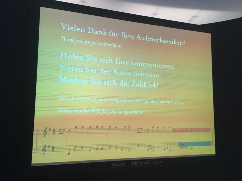
Write your own waltz
The second floor, the Sonosphere, was awesome. The first room the lights are down and a large spherical screen in the centre shows an image of a living fetus. Text on the screen explains the sounds you’re hearing are the same ones a fetus hears in the room. It’s an appropriate beginning for a gallery that explores how humans interpret, interact with and use sound.
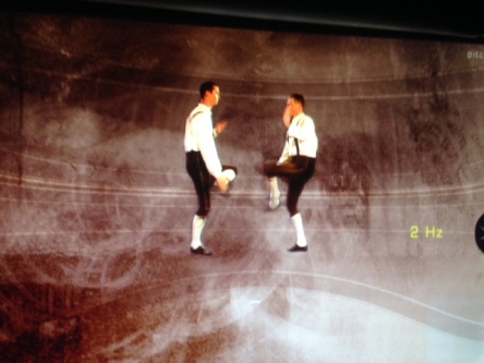
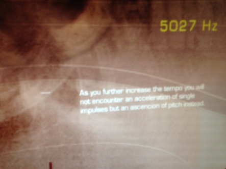
The design of the Sonosphere section is very futuristic and sci-fi, and full of different interactive stations, each of which teaches a little fact about sound or music. For example I spent some time learning about musical tempos with the below interactive. You controlled the speed of the dancers with a little dial under the screen. Eventually, their clapping and stomping became a single note. The last screens explained how sound waves work. Another looked at pitch, others at white noise, how your hear your own voice and so on.

There was a real sense of fun throughout the floor, with guests experimenting and playing with the displays. I definitely felt more at ease than I normally do in a situation focussed on classical music. There was also a room that played classical music but re-mixed as dance music.

Listening to sounds from around the world

Surround sound
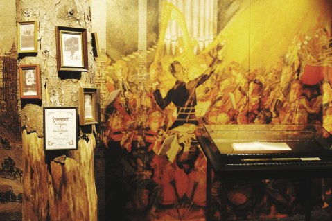
The Great Composers floor was, for us, less interesting in content, but I have to comment on the beautiful design. Each composer, Mozart, Beethoven, Handel etc. had their own themed-room full of information about their lives and compositions. Beautifully and sumptuously designed it was lovely to walk through. Sadly my pictures haven’t come out very well and don’t do it justice. The ones below are from the Museum website…

At the end of this section you could have a go at conducting an orchestra. On screen an orchestra was playing a famous piece, such as the can-can. As you moved the baton, the players matched your tempo…you could go incredibly slowly, but if you went too fast they started to complain!
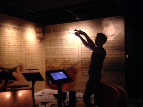
Maestro at work
The final section was the VirtolStage, where you could compose and direct your very own opera, simply by dancing in front of an interactive screen. After three hours of playing with sound and music we had lost all inhibitions and went for it. Also a great access tool for those with difficulty reading or hearing.

(Image from HausderMusik website)
Highly recommend Hausdermusik. Once you’re past the overly dense and dull first room (I cannot remember a THING from it), it’s a wonderful, fun way to spend an afternoon, and learn a lot too. They did a really great job of fascinating the hard-core classical music enthusiasts, while encouraging everyone to have fun and enjoy music.
Peace Memorial Museum, Hiroshima
I recently spent two weeks travelling around Japan. We hopped from Tokyo to Kyoto, Sapporo, Koyasan and Hiroshima. Japan is full of exciting things to do – food, Shinto shrines, vending machines, digital loos, anime, bullet trains, gardens, capsule hotels – to name just a few. However, Museums were top of the list for me and I managed to drag my traveling companions to one pretty much every other day.
My overall impression of Japanese museums was excellent. They’re well-funded, carefully conceived with clear missions, provocative design, and great objects. I plan to write them all up, but for now want to talk about the Hiroshima Peace Memorial Museum.
![]()
The Museum was established in 1955 (and renovated in 1991) to tell the story of the atomic bomb that destroyed the city of Hiroshima on 6th August, 1945. The bomb, dropped by US troops, killed over 100,000 people. The Museum serves as both a memorial to the victims and a promoter of Peace.
To get to the Museum, you walk through the Hiroshima Peace Memorial Park. It houses several memorial too including the A-Bomb dome. It all seems so…calm. So pretty.
The building itself looks a bit like a war-bunker on stilts. The entrance is clinical and simple. There’s nothing about the content in the ticket hall or cafe. The East Wing was under renovation when we visited so the below is only about the West wing. The East will deal with Hiroshima the city before the bomb dropped and the lead up to nuclear war.
The West Wing details the effects of the atomic bomb on both the city and people. I’ve kept my description very brief as I can’t really do it justice here. You have to see it yourself. Think of this as a taster and a motivator to visit.
The museum is horrific. By horrific, I mean a graphic exploration of all the effects of dropping a nuclear bomb. I’m not going to write a history lesson about Hiroshima, or give you all the gory details. If you don’t know, read about it
Walking into the West Gallery, you’re immediately thrust into the midst of that day. They don’t hold back with the design, the objects or the text. Setworks depict the immediate aftermath of the bomb hitting. The design structures are functionally grey, the objects numerous and powerful and the text simple and punchy.


The first major installation is a large map of Hiroshima. It shows where the bomb dropped and the scale of devastation it wreaked. Interpretation around the map gives you the key facts and figures – how many died, how many children … Each fact hits home.
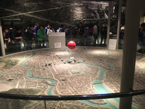
Map of Hiroshima. The red ball shows where the bomb hit.


I noticed there was no music or soundscape at all. I thought a brave choice by the exhibition team and very effective. With no sound to comfort the visitor or cushion the experience, it was raw and hard.
The poignant and famous story of Sadako Sasaki is prominent. A toddler when the bomb dropped, she suffered radioactive poisoning. Years later, she had leukemia, but fought every day to live. She heard about a legend that said she would be granted a wish if she folded a thousand paper cranes. Planning to wish for her life she set about folding. Sadly, her wish was not granted and she passed away age 12. Today she is one of the the most widely known hibakusha — a Japanese term meaning “bomb-affected person”. Children continue to make paper cranes and leave them at the Children’s Peace Monument in the park.


The second half of the museum focussed largely on the science of nuclear warfare. It was a little odd after such powerfully human stories, but I think deliberately done to help you cope.


I was impressed with how they handled the potential political messaging. There was no blame or hate towards American troops. Instead, the focus was purely on the innocent victims of the bombing and reminders of the devastation of war.

Cementing Peace
Into the Deep- London Aquarium
I’ve started a new project at work – a temporary exhibition focusing on ocean ecosystems (no more details for now). It’s that really exciting time where you’re reading all about the topic and visiting other sites to see how they’ve approached similar content.
First stop: London Sea-Life Aquarium. I have to confess – I didn’t even know it existed so really didn’t have any expectations. What struck me most about my visit was just how BIG the place is. There’s loads to see – took us well over 3 hours to get through, despite racing through so we could get back to the office.
The entrance area is a bit gawdy, with over-the-top characters and some garish graphics. As soon as you get through it though, there’s a lovely moment where you walk over a glass floor covering a large tank full of sea-life, your first glimpse of some of the creatures you’re going to encounter . We had to wind ourselves around a group of toddlers who were absolutely glued to the floor.


Many of the exhibits consisted of beautiful tanks, filled with all sorts of weird and wonderful creatures. The panels next to each tank gave a really nice amount of information which we really enjoyed. I do wonder how much they’re read though considering they’re competing with live animals. Also, a few of the digital panels weren’t working which was a shame.


The design was very nautical throughout which I wasn’t a huge fan of – it would have been nice to feel as if we’d travelled further than a few feet off the coast. It always felt as if they were telling the story of humans’ relationships than delving into habitats and ecosystems we normally never get to see.


The main message was definitely conservation. Everywhere you turned it was all doom and gloom about hunting sea-life and dwindling populations of different species. I agree it’s an important message, but honestly it was so overdone that I became a bit numb to it. Also, they didn’t go into detail about WHY this was important. I think they’ve tried to overcompensate for the controversies that surround zoos and aquariums.


Some more pictures:


Penguins: really cute but a bit depressing to see them so cooped up.

Their main big tank with a reconstructed whale fall and giant turtle!

I didn’t’ really understand the Easter island statues…
Reading back over that, I think I’ve ended up being quite negative. I really did enjoy the trip to the aquarium. There were some amazing things to see and some wonderful examples of interpretation.
Location: South bank
Price: £19.50 (online)
My first foray into digital
This is a reflection (and a bit of self-therapy) about my recent experience developing digital content at NHM. Like many museums, we’ve been slowly trying to catch up with the digital age…edging our way into the 21st century. We’re acutely aware that most visitors expect some kind of digital offer these days, before, during, after and sometimes instead of their visits. Walking around the galleries, it feels as if most people spend the majority of their times swiping around on their phones. With something already so engaging, it would be foolish of us not to capitalise on it for delivering more content.
First off – I’m no an expert on this. However, I am fresh from developing an audio commentary designed for people to access on their smartphones or tablets. While the digital side of it was handled by the professionals (rightly so!) I did come away with a new appreciation of what we realistically can and can’t do on such a platform.
I (naively) assumed it would be pretty simple. Develop the content (stories and scripts for the audio), record it, and hand it over to the designers and developers. Hey presto! There’d be a beautiful audio commentary I could show my friends with pride.
For starters, writing scripts for audio, deciding on the format, recording non-voice actors, editing and mastering clips is a huge amount of work. But that’s material for another post. Here are some of the lessons specifically about the digital aspect that I took away from the experience.
- It takes much, much longer than you think. This is probably true for everything developed in museums, but really, you need time for digital stuff. Between deciding what the digital element will be, how visitors will access it (web, mobile, touchscreen), how to design it, what kind of functionality you want, the user experience, how it will fit in the physical space… There’re so many considerations and different expertise that need to be involved. It’s exhausting and definitely not a quick-fix solution.
- Developers are invaluable – be nice to them. The developers build the actual thing you’re offering. Yes I worked on the content, but without my wonderful developer there’d be nothing to show people apart from a bunch of audio clips sitting on my desktop.
- On that note- It really helps to learn a little bit about the digital field. I decided quite early on, after a meeting with the developers where I felt completely lost, that I should familiarise myself with their world. I read a bunch of UX blogs, and learnt a bit of code (thanks to the wonderful codebar). It made such a difference being able to speak to the developers in their language.
- Design is so important. There’s a reason there’s an entire field devoted to digital design and user experiences. There are certain things people now expect when they access anything on their phones and you need someone who knows what they’re doing with this. They were able to anticipate how visitors will behave, what kind of prompts they’ll need and how to make sure the whole thing is easy to use.
- We had to match the digital to the physical space. I didn’t want visitors just looking at their phones the entire time. We developed an entire exhibition and this was supposed to be a free extra! The offer was a commentary to an art exhibition, adding another layer of content and perspective to the images, without overshadowing them. We had several conversation about how to make it as intuitive as possible, help people find the clips and match them to the images, and the appropriate length and tone of the clips (short and informal!).
- Communicate it to your visitors! It’s all very well developing an audio commentary but we almost ran out of time and money to tell people it was available and how to access it. The format we chose requires a bit of time and effort from the visitor – bring phone and headphones (or we are selling headphones), type/ clink on a URL and match clip to image. All instructions had to be crystal clear and ubiquitous. Printing graphics, putting messages online, creating instructional animations, all cost time and money and need to work with the space and design.
Visitors expect digital now. Museums are and have been changing in response to this – some much faster than others. The Metropolitan museum of art in new York holds hackathons, you can roam around the British Museum using Google, NHM has VR experiences and more and more are putting their collections online. It’s an exciting time to be working in public engagement as we strive to keep up with the new technologies.
Samuel Pepys: Plague Fire and Revolution. Excellent objects, Excellent access, standard storyline.

I hopped on the DLR to Greenwich last week to have a gander at the National Maritime Museum’s new temporary exhibition last week. The exhibition focuses on Stuart London, using Pepys’ diary as a lens to explore a turbulent century that saw civil war, the Plague and the Great Fire of London that devastated the city.
Pepys was a colourful character. He not only witnessed all these famous events but recorded them in detail in his famous diary. The exhibition boasts over 200 paintings and objects from museums, galleries and private collections across Britain and beyond.
I had high hopes. I’ve loved several shows at NMM before and the Astronomy Photographer of the Year at the Royal Observatory is one of my favourites. I also know that the Royal Museums Greenwich have some wonderful collections from that time period. Overall, I wasn’t disappointed. It was a very thorough and competent walkthrough of the time period, and the viewpoint of the diarist gave it a lovely personal touch.
Despite being mostly a traditional approach to an exhibition – a chronological timeline and design evoking the time period, there were a couple of lovely moments. A simple opening monologue, for instance, illustrated by a painting loaned in from the National Portrait Gallery, “The Execution of Charles I, unknown” set the scene in a dramatic and instantly enthralling way. As the narrator talked through the day of the execution, the relevant parts of the image lit up to show the crowds or the executioner or the King’s severed head. Definitely brought the events to life and served as an excellent introduction to the show and Pepys, who as a teenager stood in the crowd and watched the King’s head roll.
I was particularly impressed by the objects on display, and just how many of them were loaned in (dread to think of the paperwork). Highlights for me were King Charles’ blood on a scrap and portraits of the King’s mistresses – the accompanying text gave just the right insight and information to titillate and intrigue.
There were quite a few attempts to make the exhibition interactive. Touchscreens throughout displayed scans of relevant sections of Pepys’ diary. A touchscreen activated a modern day text of the page as you scrolled over it. This was a really lovely idea and a great way to get people to engage directly with Pepys’ words. Sadly, as is so often the case with digital interactives I really struggled to get it to work. Nice idea though. Also, several of the panels and caption already seemed to be wearing – I wonder if all the effort on loans meant costs were skimped on production? Those cursed museum budgets again!
I was also impressed by how much thought had gone in to making it accessible. All videos were accompanied by a sign-language display, there were large print guides and a lot of thought clearly went into font size and colour. This is a trend you can see more and more in Museums and it’s slowly becoming a part of normal practice, rather than an add-on if funds allow.
I really enjoyed the exhibition in all. Learned some interesting nuggets, got to see some fascinating objects and it really piqued my curiosity about Pepys.
Key Information
Location: National Maritime Museum, Greenwich
Date and time: 20 November 2015 to 28 March 2016, 10.00–17.00
Price: £12 adults | £6 children | £10 concessions | £31.50 family
Viktor Wynd’s Museum of Curiosities
The modern-day cabinet of curiosities in hackney lives up to the hype. An Aladdin’s cave of everything weird, wonderful and a bit icky, you could easily spend a few days in here gawping at the “treasures” on display – although the cramped quarters might give you neck-ache.
I tried and struggled to find any kind of coherence or narrative to the displays – but I gather that’s the point.I’ll let the pictures speak for themselves.


Intriguing offer


Extinct bird feathers

Furbies are now museum-worthy!


The Great Outdoors
I’ve been completely neglecting this blog for the past six months. In my defense I’ve moved house and started a new job in that time. Still, time to clear the backlog a bit.
As part of the new job I’ve been visiting all sorts of outdoor exhibits, which I’ve (briefly and hurriedly) written up below. I’ve discovered some hidden and not-so-hidden areas around London, fed ducks, spied on dinosaurs, giggled at sheep, hummed along to bee hives and shed tears over poppies.
Sorry it’s a bit rushed. Will try to do better in future. Happy museuming!
Spitalfields City Farm
A mini oasis, and perfectly in tune with the oh-so-hip Shoreditch, the urban farm boasts cows, sheep, chickens and goats as well as greenhouses, ponds and bizarrely a red phone box. My favourite thing was definitely the Bug Hotel. You can listen to bees buzzing around doing their business! Most impressive was the scale and depth of the whole thing. They seemed to be growing every European plant imaginable, funding art projects and being completely environmentally friendly.
Only gripe was the café wasn’t open so had to meander sans coffee.


Tower of London
I went down to watch the Blood Swept Lands and Tears of Red being installed at the Tower of London. The poppies were still being planted and it’s great to watch the volunteers at work and get a sense of what a massive undertaking this is.
The scale of the installation renders it very effective and the atmosphere in the crowd was cheerful but subdued. I’m planning to volunteer myself. Here’s the link if you’re interested: http://www.coming-home.org.uk/content/tower-london-poppies-volunteer-now


Kew Gardens
I was really pleasantly surprised by the exhibitions here. A highlight was the Healing Giant which used objects and plants brilliantly to get across the message. For instance, placing a First Aid Box around the eucalyptus plant – illustrated how common this plant is in soothing creams. Text was written across bottle and coffee pots and they’d even put a hospital bed underneath one flower bed – the plants in the bed are used to treat leukemia.
Also loved the log trail and the barefoot walk.


Crystal Palace Dinosaurs.
Go and see them. No really. And listen to the audio guide when you’re there. Ridiculously fun.


Horniman Museum and Gardens
It’s been a while since I’ve wandered around the Horniman Gardens. They’re a mix of petting farm, botanical garden, physic gardens, museum exhibits and stately home grounds. I especially loved the huge musical instruments – although there are also plenty of quiet places free of children and noise-makers 😉


Irish Museums, North and South
I spent a lovely few days in Dublin this week and didn’t waste the opportunity to check out the museums on offer. I managed to tick off the Chester Beatty Library, the An Post Museum, Guinness Storehouse (OK, not technically a museum) and – following a two-hour coach trip – Titanic Belfast.
There were several more I’d have loved to see – the National Museum of Ireland, The GAA Museum and Armagh County Museum to name a few – but rugby and pubs proved a worthy distraction.
Still, plenty of museum-fun was had:

Here is Kris learning all about the various ingredients of Guinnes (guess which?). The Guinness storehouse was as fun as it sounds – interactives, AV, tasting sessions and good old fashioned text panels galore. Although unashamedley a brand centre (you can’t escape the constant references to Arthur Guinnes and his legacy), and pretty steep at over 16 euros each, we had a great 3 hours learning about the manufacturing process, history of advertising, completing quizzes and starring in our own Guinness ad before finally reaching the promised Gravity Bar and our well-earned free pint!
Titanic Belfast, another commercial attraction rather than a museum, was a completely different experience. I was happy to be there with a Northern Irish native to get his perspective on this sensitive topic. The verdict was largely positive – especially thanks to the sign below in the Boomtown Belfast gallery… and the clear focus on Belfast and its accomplishments. However, there’s a lot of text and material to get through and a few of the interactives weren’t working, or didn’t flow properly – didn’t help we weren’t at our freshest at this point following an early morning bus journey. We found there was often so much going on in each gallery, and audio effects were so loud, that it was difficult to focus. I did find it fascinating to hear the story of the Titanic from such a different perspective and the many things her fate symbolised to so many.
Quite steep entry price again (15 euros, if memory serves) but you do get a lot for your money.
Just in case I ever forget…
Letters, Lives and Liberty at An Post was one we both really enjoyed. Interesting as it’s by far the smallest of the lot and, as a museum, has the lowest profile. Everything just worked so seamlessly, the messages were clear and the whole experience was sweet, informative and enjoyable. The history of the Post Office in Ireland and the GPO was conveyed in a dynamic way, using personal stories to illustrate the various aspects of its day to day running and its importance to the running of the country. There was a short but perfectly executed video on the events of the Easter Rising – showing the reactions of postal workers as events unfolded. We both thought it would have been nice to learn more about what led to this event, and its ongoing effects for Ireland, but I’d imagine there’s a plan for 2016!

A new Irish stamp designed by yours truly at the An Post Museum. So many fun interactives!
The Chester Beatty Library was one I was really keen to see – I’ve heard rave reviews about it from so many. I have to say it did not disappoint. If you have any interest in culture, religion, scholarship, collections etc. they’ll be something for you. I couldn’t wrap my head around just how comprehensive the collections of manuscripts were and how important each and everyone was. On top of that the display was impeccable, from colour swatch to narrative trail. Definitely something for me to aspire to.
There was also a small temporary exhibition of Parisien costume which made me feel very unkempt indeed. However, I am now a firm fan of Armand Vallée. Best of all, the whole thing, permanent and temporary, was FREE!
Can’t wait to get back to Ireland and see some more!
What a squid!
This weekend I went on the Spirit Tour at the Natural History Museum – there are a couple of Natural History Jobs going on at work so thought it might be useful. I didn’t really know what to expect so went in with an open mind. After navigating the jam-packed halls (is it normal to be both delighted and frustrated by this?), I made it to the Darwin Centre.
Our very knowledgeable tour guide talked us through the background of the collections -over 80 million specimens and more different types of species than anywhere in the world– and I resisted the urge to question him on their acquisitions policy and funding strategies.
The Spirit Rooms are clinical, eerie, yet absolutely enthralling. Bats, whale fins, snails and rabbits in jars – who knew it could be so interesting? Without a doubt the highlight was the giant squid – again just revoltingly fascinating. Although I wouldn’t say I learned a huge amount about museums myself, it was wonderful to see such a famous and prestigious museum in action, fulfilling one of the less celebrated, but no less important, functions of a museum – research!
Highly recommend the tour – gory, gross and gratis!
Be part of a new exhibition!
I’ve been a bit lacking on here recently – new job and fabulous sunshine keep tempting me away from my computer. This is a quick one to spread the word about a new crowdsourcing project by the Palestinian Museum. The museum is inviting you to submit personal or meaningful objects for their new exhibition. A great way to start sharing stories and experiences!
More details here:https://www.youtube.com/watch?v=_SZPePKIq98
Follow them on Twitter:@palmuseum
